Project Overview
- Role: User Interface Designer
- Class: Capstone
- Methodology: Goal Directed Design
- Project date: Spring 2024
- Project URL: Skeleton Key Prototype
Crafting a Playful User Experience
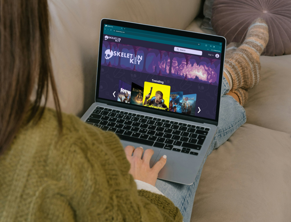
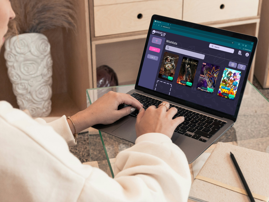
For the Skeleton Key project, I served as the lead user interface designer. I was responsible for developing complex Figma components such as game cards and carousels, all aligned with an 8-point grid system to maintain consistency. I focused heavily on creating smooth user interactions, especially around hover states and carousels, ensuring a visually engaging and intuitive experience. The project lasted 16 weeks, and it was an incredible opportunity to apply Goal-Directed Design principles while working with a talented team.
Method
Skeleton Key's development fully embraced the Goal-Directed Design (GDD) method, a systematic
approach
crafted by Alan Cooper. GDD was the cornerstone of our design process from inception to
completion.
Typically, this process starts with stakeholder and kickoff meetings and culminates in the final
product. Given the 12-week timeframe of our semester, we adapted GDD to fit our project's
timeline.
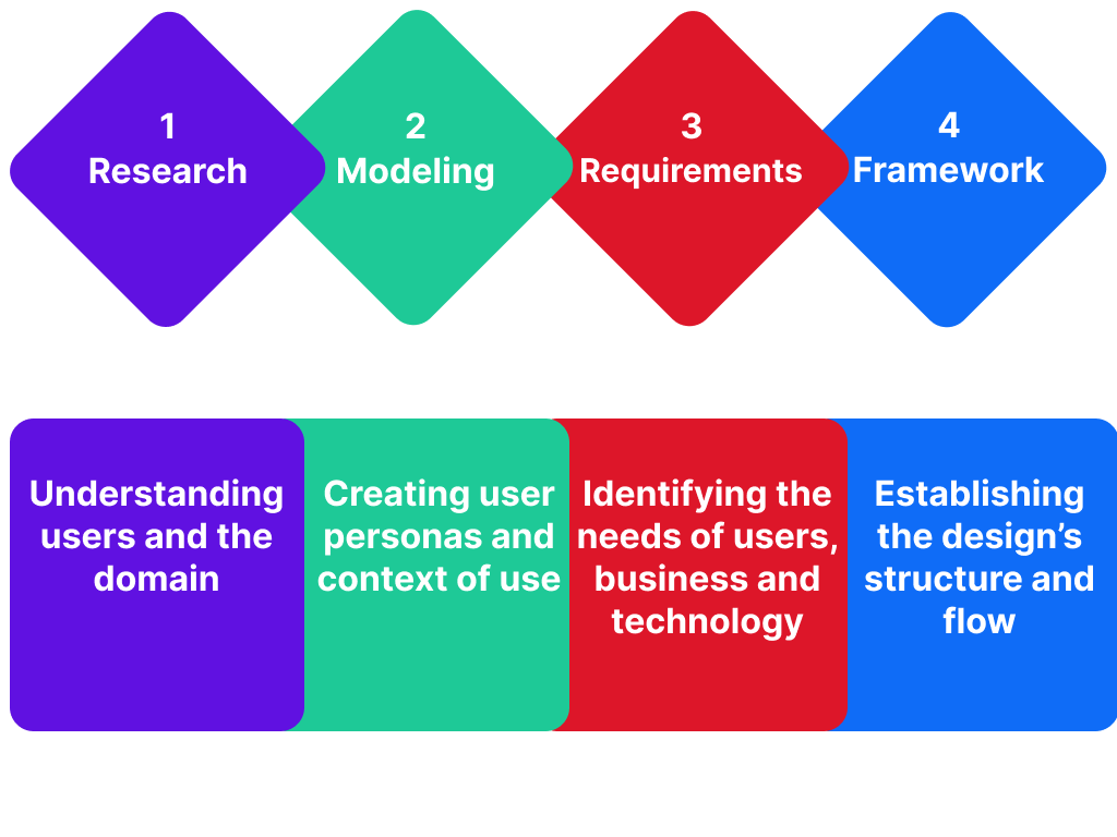
We diligently followed these phases:
- Research: Understanding users and the domain.
- Modeling: Creating user personas and context of use.
- Requirements: Identifying and defining the needs of users, business, and technology.
- Framework: Establishing the design's structure and workflow.
- Refinement: Enhancing behaviors, aesthetics, and content.
The primary objective of this design approach was to ensure that the app aligns with user goals at every stage. The subsequent sections offer an in-depth exploration of each phase, emphasizing how they collectively contribute to creating a user-centric and goal-oriented design.
Research
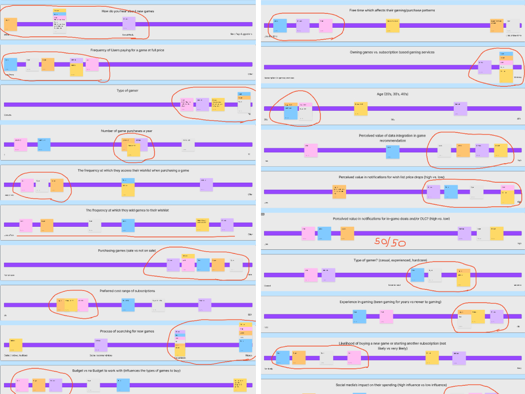
During the research phase of Skeleton Key, I focused on understanding user needs by studying existing game collection platforms and conducting user interviews. I discovered that users wanted more visual clarity, easy access to game details, and the ability to customize their collections. These insights informed the design of flexible, modular components that seamlessly integrate with the interface to support various navigation and interaction patterns.
Modeling
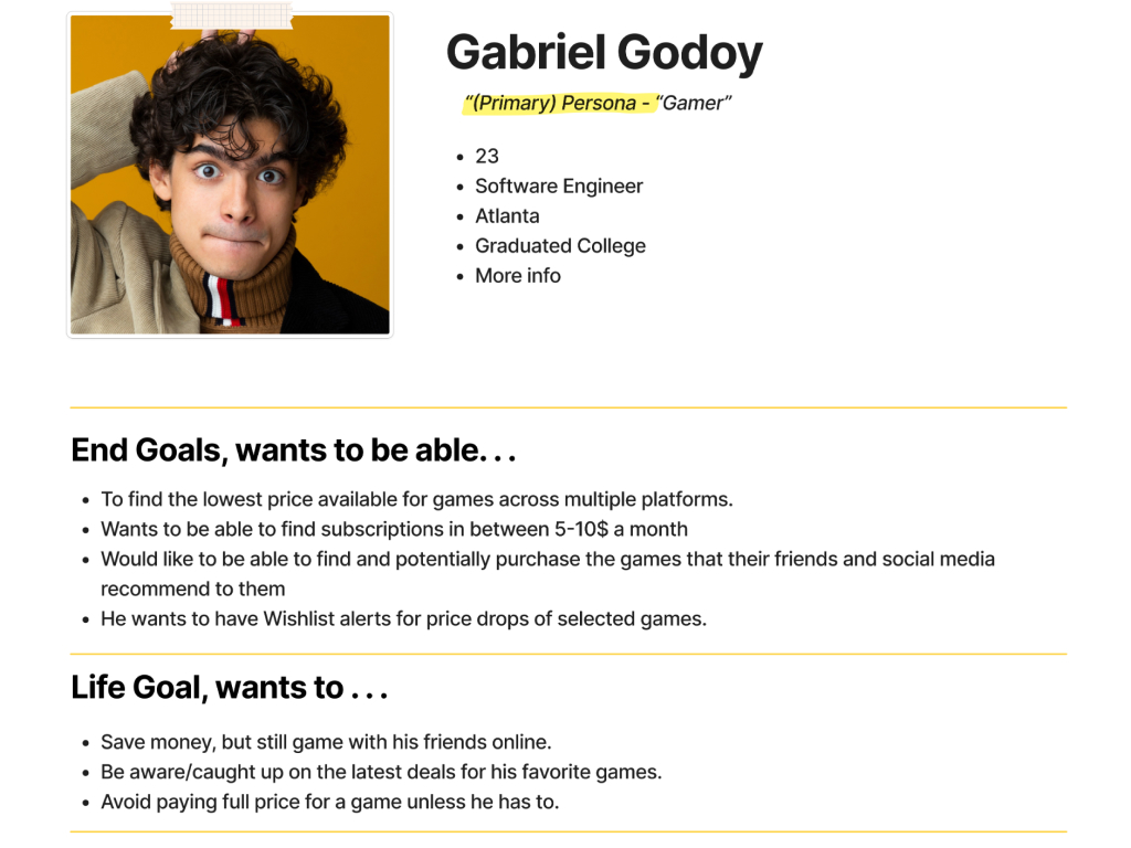
I created user personas that represented different types of gamers, from casual players to avid collectors, to guide the development of detailed component sets. I also mapped out user journeys to see how each component would fit into the overall experience. This helped ensure that the interactive grid layouts and expandable game cards met the unique needs of each persona and provided a meaningful, streamlined experience.
Requirements
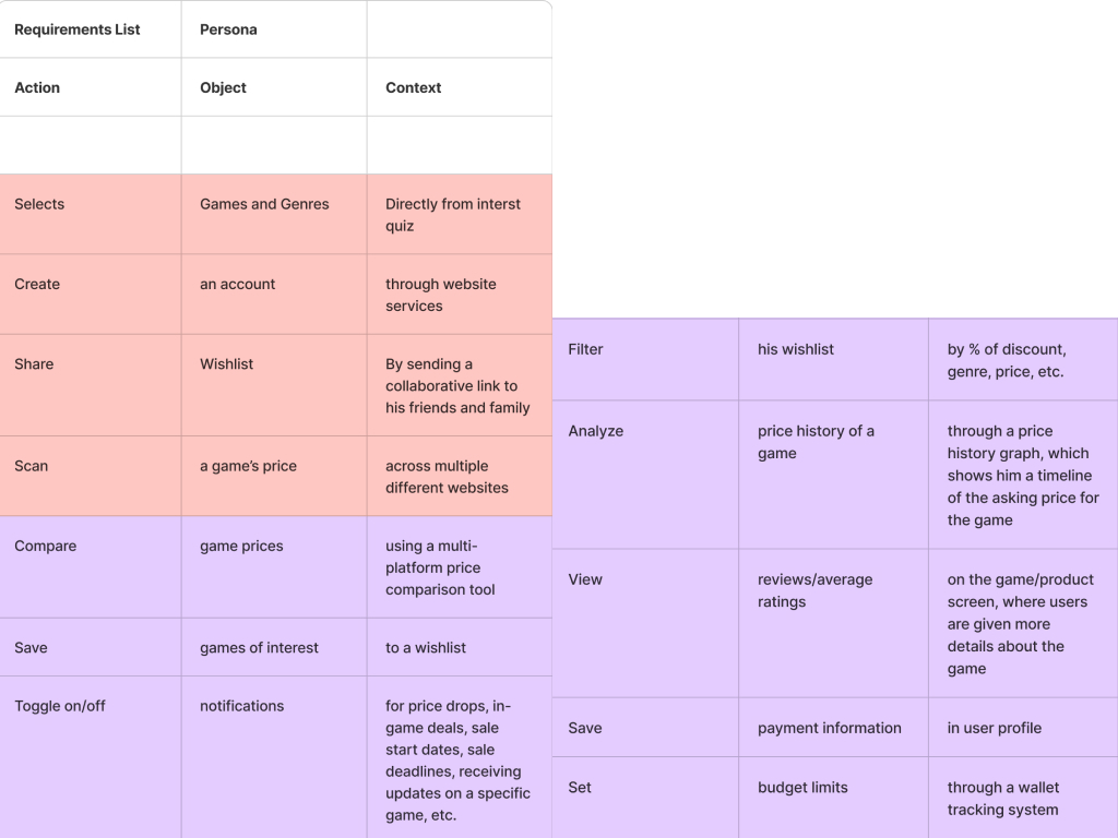
To define the requirements, I considered both user needs and business goals. My main focus was on creating adaptable, consistent, and reusable components, such as modular card designs and collapsible menus. I made sure they were easy to integrate, accessible, and provided smooth transitions between game management and exploration, so that they could enhance the user’s experience regardless of the collection size or device used.
Framework
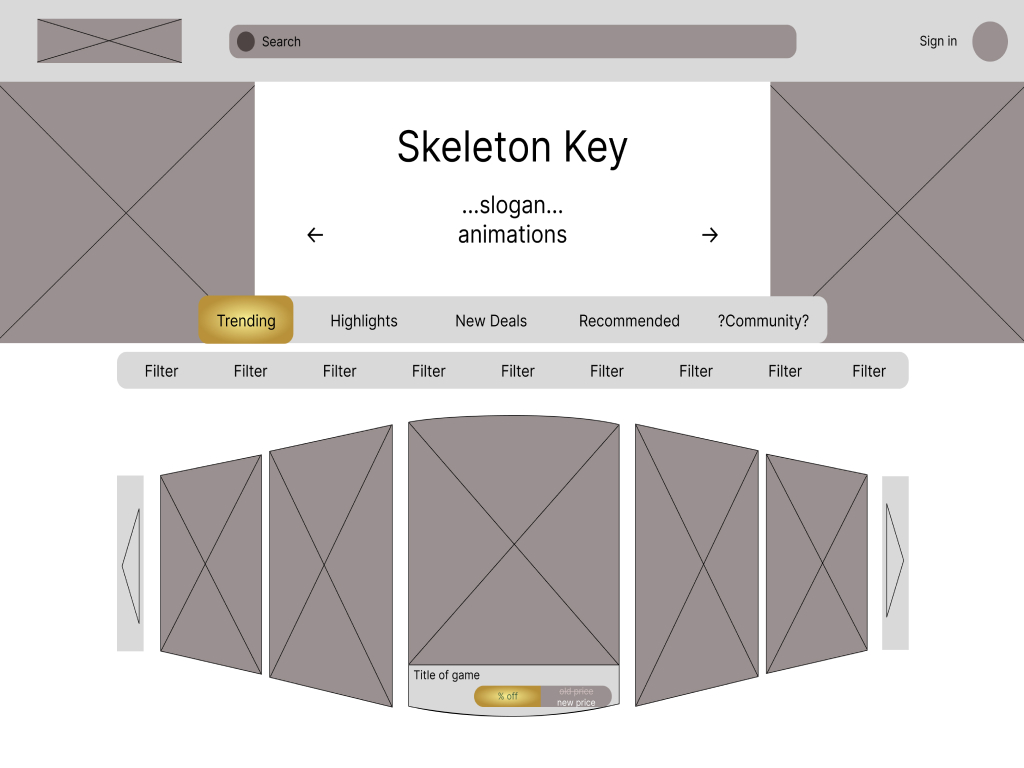
I built the framework for the component set through several wireframe iterations and design sprints. Each layout tested different placements for interactive cards, navigation menus, and pop-up elements. I refined the structure to maintain visual consistency across all screen sizes, ensuring that the components offered the same seamless experience on any device. I also included responsive grids and adaptable spacing to provide a clean, cohesive layout throughout the app.
Refinement
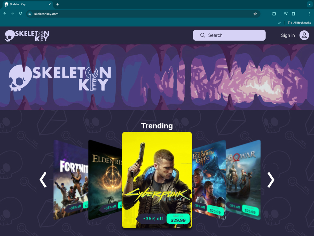
The refinement process was all about polishing the design based on user feedback. I focused on refining interactive elements like hover effects and transition animations to make the experience more engaging and enjoyable. I iterated on each component—whether it was a game card or a navigation menu—until it felt polished and cohesive, ensuring that every element fit perfectly into the overall look and feel of the app.
