Project Overview
- Role: Team Lead
- Class: Interaction Design 1
- Methodology: Goal Directed Design
- Project date: Spring 2023
- Project URL: Atlas Prototype
A Budget-Friendly Travel App
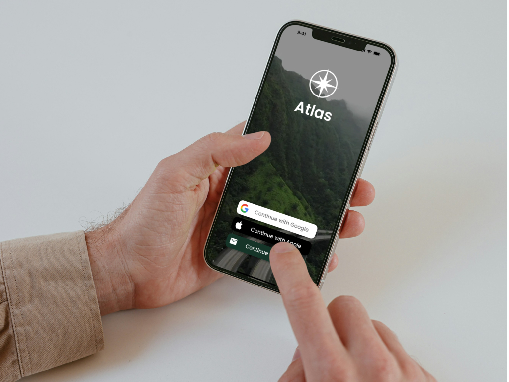
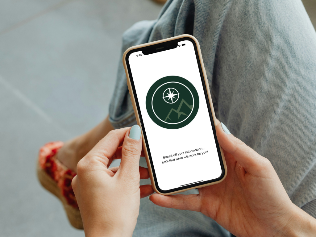
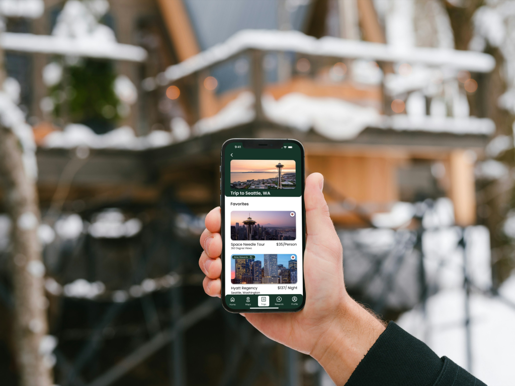
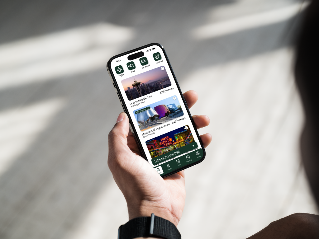
In the Atlas project, I led the design of a budget-conscious travel app that helps users plan trips based on their preferences, including destination, budget, and time. We used Goal-Directed Design (GDD) to ensure a user-centered approach. I was responsible for overseeing user research, wireframe creation, and usability testing. The app features personalized itineraries, budget-friendly travel recommendations, and integrated booking options. Our research guided the design to cater to a wide range of users, from college students to business professionals.
Method
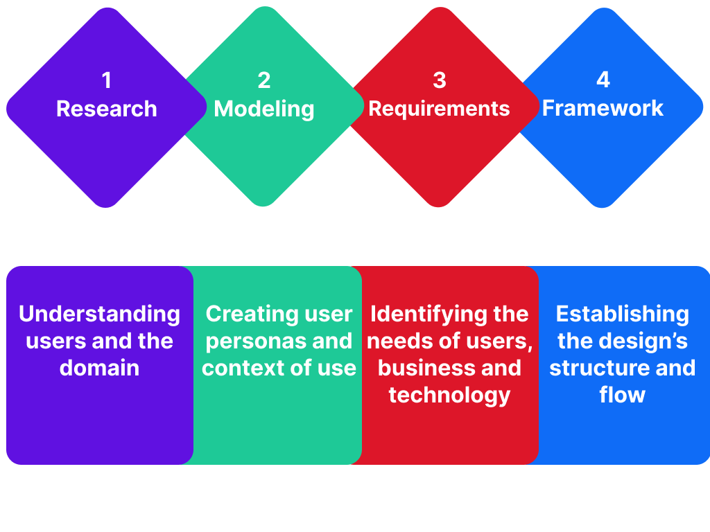
The development of Atlas fully embraced the Goal-Directed Design (GDD) method, a systematic
approach
crafted by Alan Cooper. GDD was the cornerstone of our design process from inception to
completion.
Typically, this process starts with stakeholder and kickoff meetings and culminates in the final
product. Given the 16-week timeframe of our Spring semester, we adapted GDD to fit our project's
timeline.
We diligently followed these phases:
- Research: Understanding users and the domain.
- Modeling: Creating user personas and context of use.
- Requirements: Identifying and defining the needs of users, business, and technology.
- Framework: Establishing the design's structure and workflow.
- Refinement: Enhancing behaviors, aesthetics, and content.
The primary objective of this design approach was to ensure that the app aligns with user goals at every stage. The subsequent sections offer an in-depth exploration of each phase, emphasizing how they collectively contribute to creating a user-centric and goal-oriented design.
Research
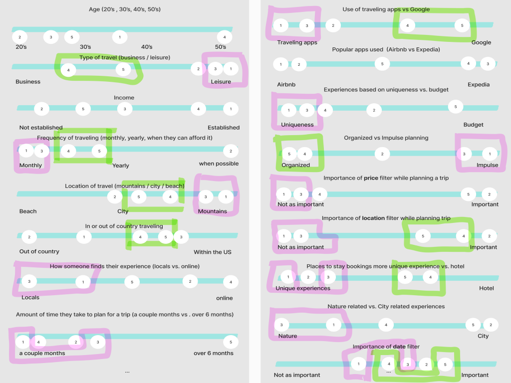
The research phase involved conducting interviews with travelers and performing competitive audits of existing travel apps. The focus was on identifying the unmet needs of budget-conscious users, such as college students and frequent business travelers. The team found that current solutions often lacked the flexibility or personalization needed to suit users with constrained budgets or limited time, prompting the need for an app that could offer smarter, more tailored travel suggestions. This phase laid the groundwork for building user-centric features.
Modeling
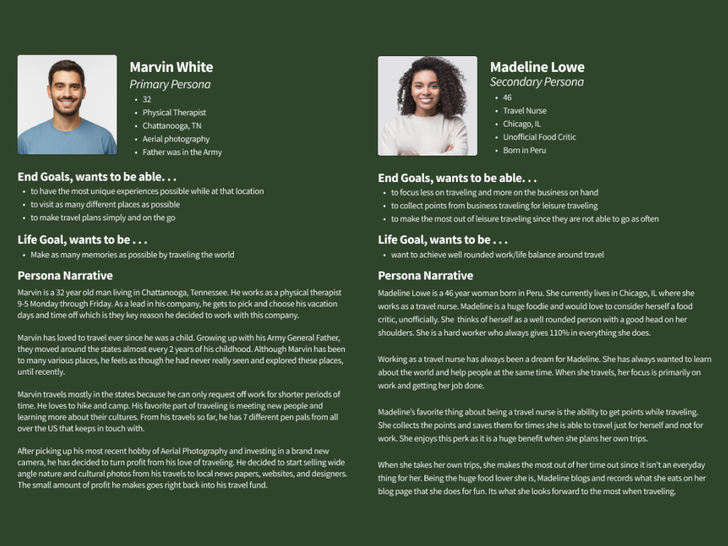
To bring clarity to the user experience, the team developed personas based on behavior patterns observed during the research. Marvin, a persona representing a frequent traveler looking for authentic and cost-effective experiences, and Madeline, a business traveler balancing work and leisure, encapsulated the diverse needs of the app's target audience. These personas helped drive decisions during the design process, ensuring the app would meet real-world needs by addressing common pain points like cost savings, ease of planning, and finding hidden gems.
Requirements
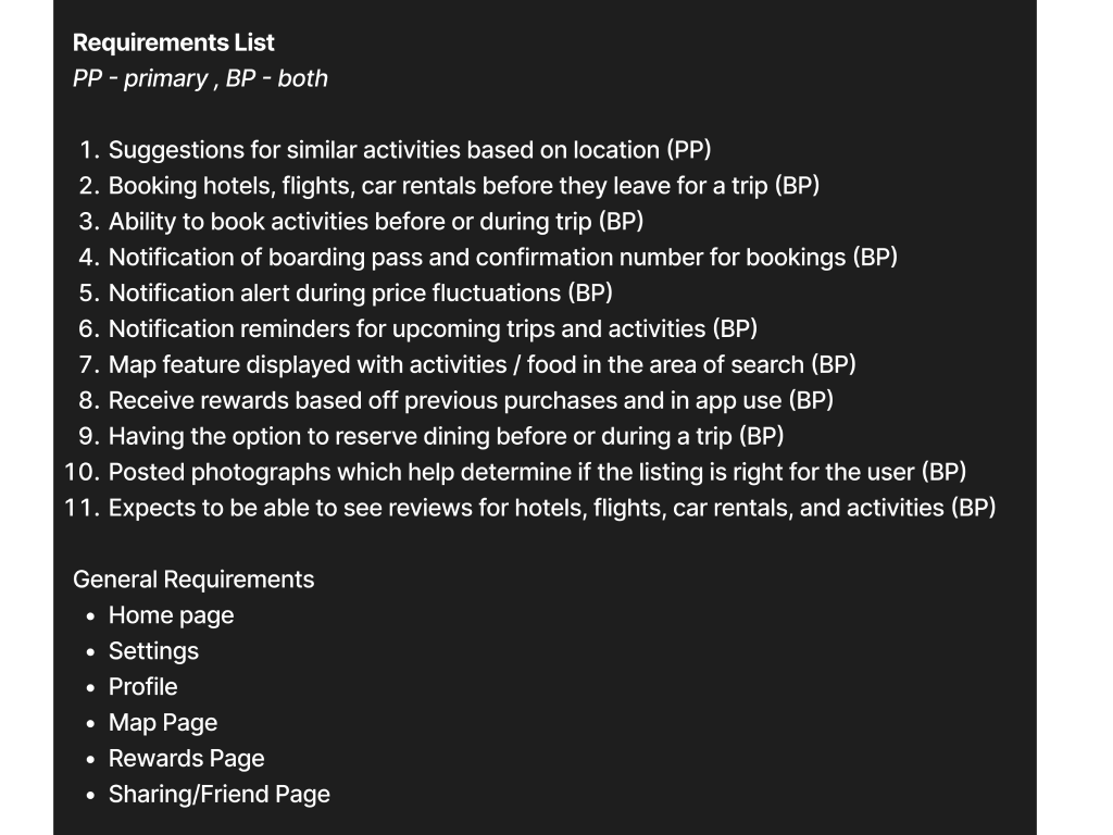
Functional and data requirements emerged from understanding users’ goals. The app needed to support features like personalized recommendations based on budget, time, and location, as well as notifications to assist in planning. Additionally, data management around user preferences and travel itineraries became essential for delivering relevant and useful suggestions. This phase clarified the technical and experiential needs that would form the foundation of the app’s functionality, ensuring users could easily navigate and plan their travel experiences.
Framework
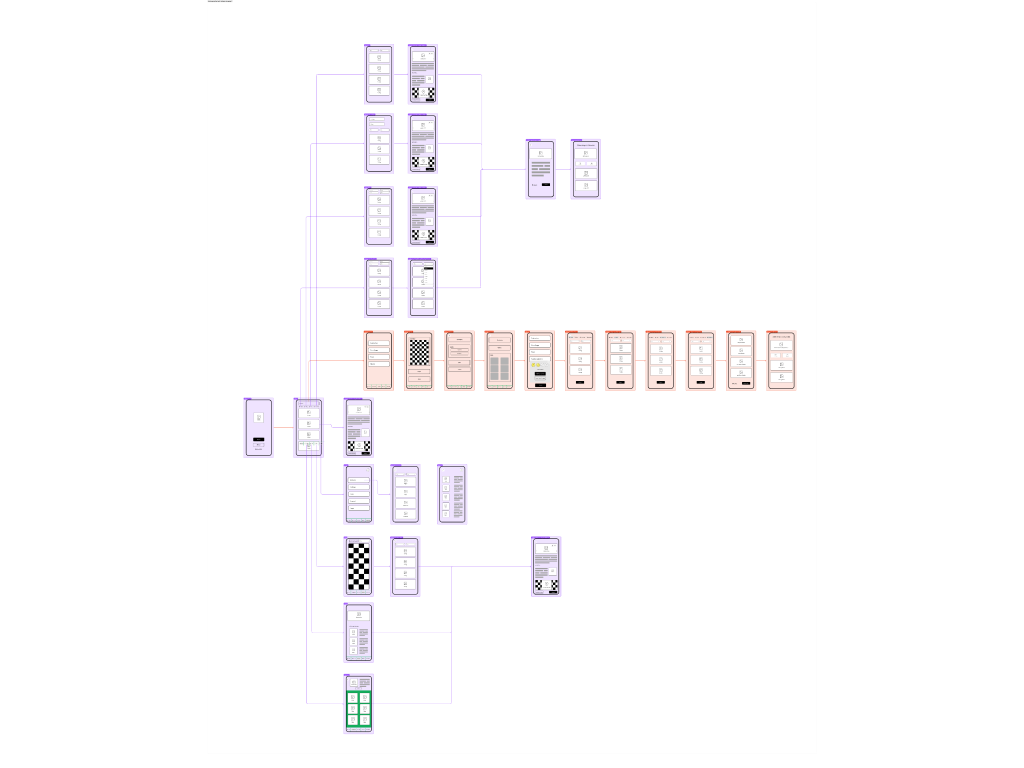
Low-fidelity wireframes were developed to map out the user experience and ensure the core functionalities could be smoothly integrated into the design. The team prioritized key user paths, such as searching for destinations and booking accommodations, to ensure the flow was intuitive and aligned with user expectations. By validating these wireframes with various scenarios, the team ensured that the app’s basic structure supported diverse travel needs, including planning for different budgets and trip lengths.
Refinement
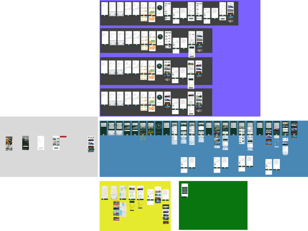
Usability testing highlighted areas where the app's user experience could be improved. For instance, participants requested clearer visual cues and additional steps in the booking process. Based on feedback, the team refined the color palette and introduced new screens to simplify navigation and enhance overall clarity. These iterations allowed the app to become more user-friendly, ensuring that both novice and experienced travelers could seamlessly interact with the platform.
