Project Overview
- Role: Designer
- Class: Advanced Social Media Marketing
- Project date: Fall 2024
Accessible Design
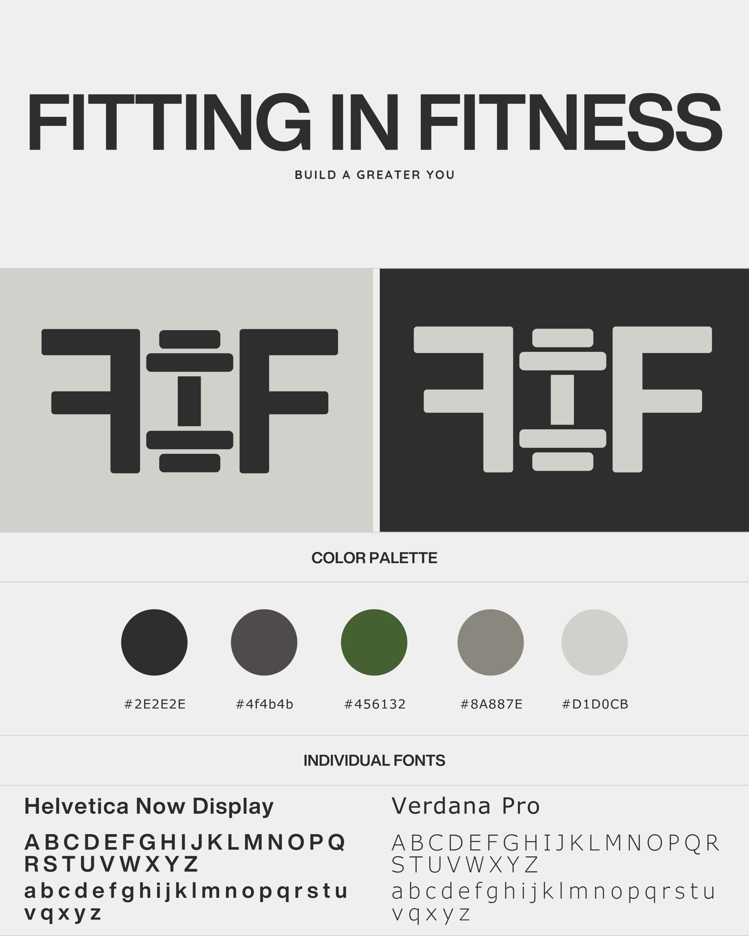
The Fitting in Fitness style guide reflects a clean and modern aesthetic, using the colors #2E2E2E, #8A887E, and #D1D0CB. These neutral tones evoke a sense of balance and simplicity, aligning with the brand’s message of seamlessly integrating fitness into daily life. The fonts, *Verdana Pro* and *Helvetica Now Display*, are both web-safe, ensuring that the site maintains consistent typography across all browsers and devices. Web-safe fonts are essential for accessibility and readability, making the website reliable and visually appealing across various platforms.
